In an increasingly mobile-first world, it makes sense to develop a strong Digital Creative Production strategy for mobile. The question is, what are the best high impact ads for mobile?
With so many choices – mobile banner ads, standard ads, game ads and more – it’s tough to decide where to focus your efforts.
But the truth is, while ad format does play a role in mobile ad performance, the best high impact Mobile ad banners just follow a shortlist of best practices.
Let’s take a look.
Mobile banner ads – Do’s or Don’ts?
There’s some controversy about the effectiveness of mobile banner ads. Detractors say the ad format is dying while supporters claim it’s a great high impact ad format for certain metrics.
Our opinion? Both sides are missing the point. Good advertising is about creating a good, relevant and memorable experience for the user.
So, do mobile banner ads do that? Not all the time.
The problem with mobile banner ads boils down to space: it’s at a premium on mobile screens, where every pixel matters. Since mobile banner ads block part of the user’s screen, it interferes with their ability to consumer or interact with the content.
Bad user experiences are a surefire way to make your brand look bad. Worst case scenario, they may even drive users to install ad blockers.
On a small screen, accidental clicks are also more likely, as users struggle to distinguish between nav bars, content and your mobile banner ad. Not only do those clicks cost you money, they irritate the viewer and that reflects poorly on your brand, too.
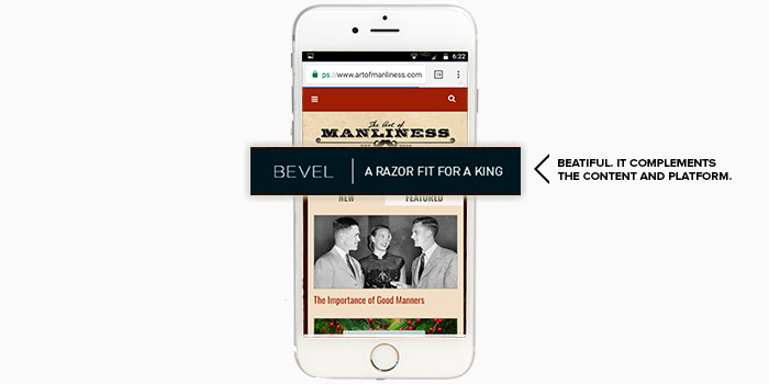
That’s one reason we recommend in-stream Mobile ad banners for most of our clients. The exception is for platforms or publishers that build custom high-impact ad formats with their digital production agency. This screenshot from The Art of Manliness is a great example of a unique mobile banner ad that complements the content and platform.
Meet your mobile audience in-stream
One of the best ways to reach mobile users is with high impact in-stream ads, like the Véa Snack ad that popped up while we scrolled through a stream of the latest news stories.
Think about it: mobile users are accustomed to scrolling through endless streams of content. Users are also accustomed to in-stream ads as part of the mobile experience. That’s why in-stream mobile ads deliver a better user and advertiser experience. Users have control over their stream and advertisers have more space to connect with the user and stand out.
Wait, what? More space? How does that happen?
On desktop, the size of in-stream ads is limited. Even with expandable ads, there’s so much screen real estate that your message is easy to ignore.
Pair that with the disconnected level of interaction. On desktop, users are disconnected from the content, clicking and scrolling with a mouse. On mobile, they’re interacting directly with their screen, and by extension, your ad.
So, the space limitations on mobile actually provide advertisers with an unusual opportunity: the chance to be front and center, snagging a user’s undivided attention with ads that occupy a large part of their screen.
Are your mobile ads loading fast? They better be.
Nothing hurts your brand (and budget) faster than slow-loading ads. It stings on desktop but on mobile, users have an even shorter attention span.
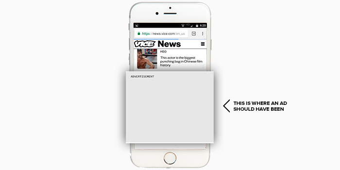
Consider this ghostly coulda-been-a-contender slot we encountered on another news stream.
We took the time to screenshot the emptiness and still nothing showed up. Since the ads didn’t impact the page load time, most users would have been 20 stories deep by the time we started scrolling again.
That’s the other reason your mobile ads need to load fast.
The longer it takes a page to load, the more likely a user is to navigate away. Not only is that a missed opportunity for your brand, if you’re a publisher, it can hurt your platform, too.
Another downfall of bloated, slow-loading ads? The dreaded accidental click, caused by jumping page syndrome.
Jumping page syndrome is an all-too-familiar (and annoying) scenario: the page jumps, thanks to slow-loading ads, just as the user attempts to click a piece of content. The next thing you know, a video about reducing flatulence is blaring from your speakers for all to hear.
Not surprisingly, users don’t appreciate (1) waiting for a page to load or (2) clicking on something they didn’t want to click on. Both reflect poorly on your brand.
And if your ad loads slowly, there’s also a risk that you’ll pay for the impression, even though it never made it front of your target audience.
Avoid slow-loading mobile ads by working with a digital production agency that knows how to optimize file sizes, without compromising your creative’s quality.
Make every word (and visual element) count
Since space is at a premium on mobile, your design and copy only have seconds to snag a user’s attention on mobile.
That’s why the best mobile ads go for short, to-the-point copy paired with high-resolution imagery. Contrary to some popular misconceptions, good quality visuals matter more on mobile than on desktop, thanks to increasingly advanced display screens and the proximity of devices to users’ faces.
(Contrast that with desktop, where screens are more likely to be outdated and experienced at arm’s length).
This piece that we built for Floating Hospital is a great example of best practices for high impact mobile ads. It relies on compelling imagery and short, intriguing copy to hold the viewer’s attention.
What do you do when brevity isn’t an option?
Animation and interactivity are always a great way to snag attention, but they’re especially powerful if you have a lot to say. Case in point, this animated VMWare ad we developed. The animation and changing fonts hold the user’s attention through every word on every frame.
The final piece in the ‘build better mobile ads’ puzzle is finding an experienced digital production agency to build out your concepts. Make sure you hash out concepts for both mobile and desktop.

