Despite being cutting-edge in the realm of the digital, rich media banner ads advertising still takes a lot of cues from real world advertising. While rich media creatives may be the forefront of display ads in the web, their methods and practices still originate from real world marketing and design concepts. In fact, sometimes a real world advertising tactic is so effective, it can even outshine digital, interactive marketing tactics.
Rich Media Vendors – Digital creative agency
Today, we’ll take a look at 10 real world advertising tactics that are exemplary in focusing on a main concept and design tactic, and then expanding from there to communicate their messages. We can’t claim that the items in this list are pure genius and are the best of the best, but they do practice one of the most followed tenets of marketing: stick to one marketing message per ad. Or in this case, one tactic per ad.
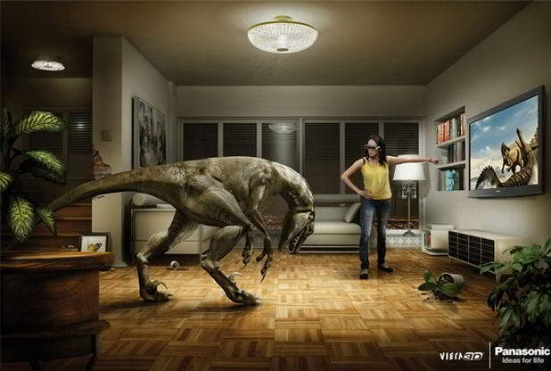
Panasonic’s 3D TV Ad – 360 Interactive Video
It’s 3D TV. So real, so eye-popping, so immersive that you’ll be seeing 3D creatures burst forth from the TV and into your living room. This ad focuses on showing the immersion and the experience that the product delivers. While a few shortcomings roadblocks slightly hinder the message – people will need a few seconds to understand the ad because there’s a dinosaur in the living room and that confusing image is too powerful it sort of overshadows the marketing message – but, you have to give it credit for sticking to its tactic. A few minor touches even make the ad enjoyable after staring at it for a minute or so: the toppled plant, the damage to the walls, that unhinged picture frame; it all looks like a dinosaur really was loose in the house.
Airplane Seat Trafficking
Rich media ads are essentially banners, so their placement is a unique consideration, especially if they are expandable Responsive Ads . This ad is a great example of the tactic of effective clever placement. Of course, the slight shock value efficiently delivers a poignant and significant message, but the placement is what stands out – and rightfully so. Not only is it conveniently visible, it also makes use of a bit of interaction, taking advantage of the person seated in front for the full impact of the ad.
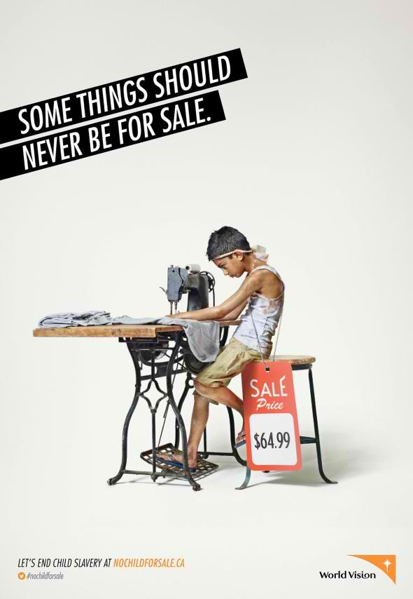
Child Labor
Since we were segueing into shock value anyway, we might as well take a look at a good example. The ad above uses shock value to its full potential – it’s not explicitly, bloody violent, but you feel the cruelty anyway; it’s not overtly shocking like looking at an act of murder, but you feel the weight of it anyway when it sinks in. Speaking of sinking in, this Effective Ads also does well in communicating the message quickly because of using literal interpretation. It’s child labor for cheap.
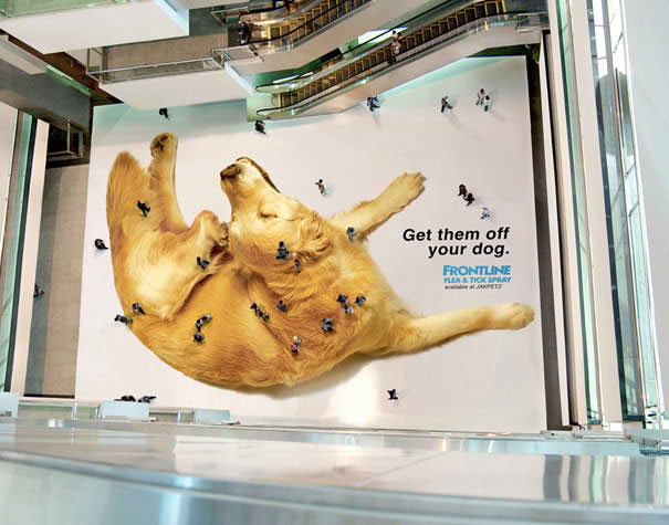
Flea People
This ad not only breaks the fourth wall between presentation and audience, it even uses the fourth wall as part of the ad. It also uses clever placement, but the position is meant to achieve the tactic of breaking the fourth wall. This is an important point to consider for rich media creatives that are engaging and interactive: how else can we breach that fourth wall and truly let our audience experience the Creative Banner?
Dragon Skull
The HBO hit series Game of Thrones is no stranger to success, and probably because aside from the great writing and source material (it’s adopted from a series of equally successful books), they have a great marketing team too. This is a life-sized dragon skull sitting on a beach in Dorset, UK. Very effective targeting of the fanfare here, I can already hear passers-by debating whether that dragon’s skull belongs to Balerion the Dread, arguably the most legendary dragon in the lore. For people who aren’t familiar to the show or the books, it’s also an ingenious way to jumpstart awareness and interest.
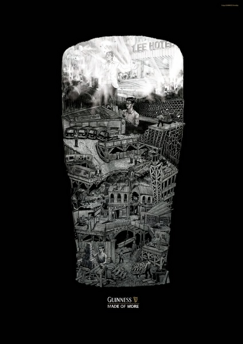
Guinness
The Guinness tagline “Made of More” translated into a literal interpretation aided by clever design. This ad is part of a series of similarly themed ads that depict different scenes within the shape of the beer glass. Apparently Guinness is made of so much more that a single ad couldn’t hold all of it.
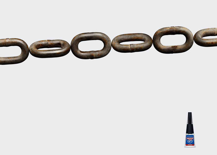
Loctite Chain
This ad shows a common object doing something unusual. You’ll have to look again to understand, but it’s not because the ad wasn’t clever. It’s intentional. The second time you look, you’ll have understood more readily, taking in the literal representation of Loctite’s effectiveness.
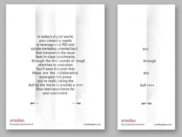
McMillan Brochure
McMillan isn’t kidding when it says “Cut through the bull****.” This brochure uses its collapsible folds to deliver a simple message, and then expound upon it (with effective marketing copy, by the way). It doesn’t even bother with aesthetic graphics or color. Talk about cutting the bull.
Sexy Glasses
This ad is part of a series of ads from Ozeal sending different marketing messages through varied minimalist designs. Here, the shape in the middle takes on two different but equally immediately distinguishable items. Even the marketing copy is minimalist: the three words “simply feel sexy”.
Underwater Camera
An honored tenet when it comes to narrative writing: show, don’t tell. And this PowerShot D10 ad does exactly that with genuine brevity. This is how you tell a story – or in this case, a marketing message – using an image instead of words. For rich media ads, this tactic is effective for showcasing the features of products. Show, don’t tell.
Well, that’s it. 10 ads, 10 focused tactics, 10 messages. Did you get their marketing message? Did the tactics help greatly, or did they perhaps take away from the message?
About the writer:
 Amir Dori has more than 10 years of vast experience in creating, developing, designing and producing creative products and marketing materials for the online advertising industry. His experience includes all creative formats for rich media, web, mobile applications and tv.

