The best digital ads – the ones that break through banner blindness to connect and engage with the viewer – are more like a game than a story. They invite the viewer to solve a puzzle, to play. They offer value in the form of clear or intriguing imagery and messaging.
That’s why in the latest roundup of the best digital ads we’ve seen around the web lately, we’re highlighting advertisers that have cracked the code on how to delight their viewers. These online display campaigns prove that effective ads don’t need to be loud or gaudy to snag attention. Some of the best digital ads are defined by sleek minimalism.
Get ready to turn your ho-hum ads into high quality banners that grab attention, build brand awareness and make your viewers want to learn more.
Bellroy: High quality banners show, don’t tell
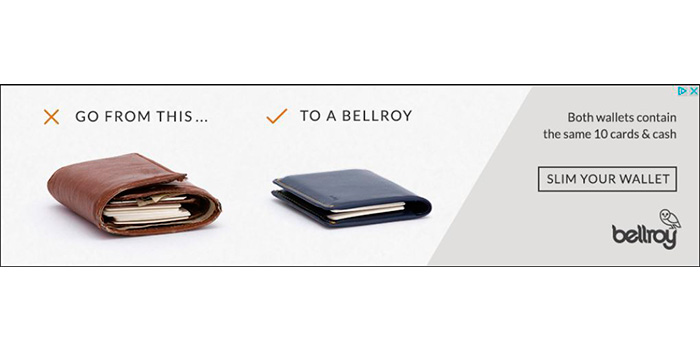
One of Digitaland (Digital creative agency) recent favorites is the ultimate example of ‘show, don’t tell.’ Bellroy’s ad is eloquent in its simplicity. Every aspect of the ad, from the imagery and messaging to the call to action, speak to the target audience’s pain point – bulky, unsightly wallets – and Bellroy’s unique selling proposition: a wallet that fits all the necessities, without needing its own zip code.
In addition to before and after visuals, Bellroy gives specific, relevant details (“Both wallets contain the same 10 cards & cash”) to show the difference with their product and address potential audience objections.
Strong calls to action are the hallmark of effective ads, and Bellroy’s is no different. “Slim your wallet” drives home the unique selling proposition of the product, further cementing Bellroy’s branding in the mind of the viewer.
Lenovo: Making every frame count in online display campaigns
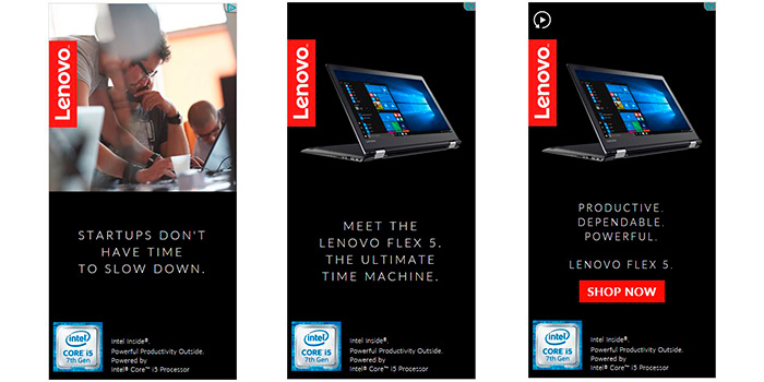
This clever multi-frame ad speaks to what its target audience cares about – saving time, productivity, dependability – while weaving subtle authority markers (Intel inside) throughout the ad. Even the color scheme – predominantly black and red – conveys authority.
High quality banners strike the perfect balance between adding value (informing, entertaining, intriguing the viewer) and promoting both the advertiser and their offering. Lenovo deftly includes their logo in every frame, building brand awareness but never overwhelming the messaging or product imagery.
Effective ads look to leverage every advantage they can. Sometimes those advantages are built into the products themselves. In Lenovo’s case, even the name of the product they’re promoting – Lenovo Flex 5 – speaks to the flexibility and agility that startups and their admirers thrive on.
Libratone: High-resolution imagery is the foundation of high quality banners
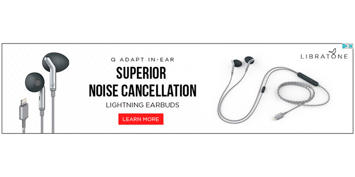
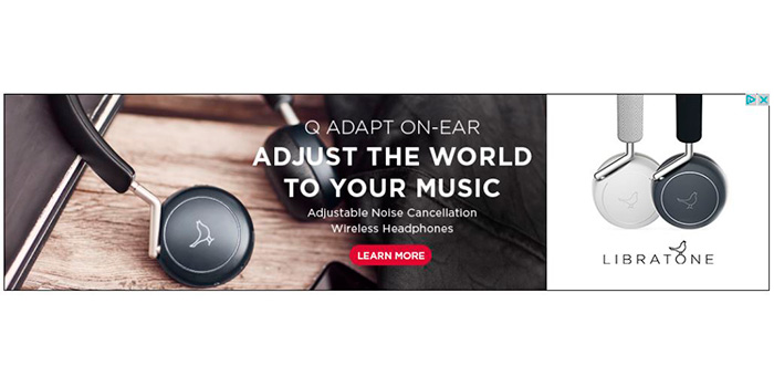
Sometimes the key to the best digital ads is to tell it like it is. Libratone has this down to a science in their online display campaigns, with clear, to-the-point value propositions: Better than Bluetooth; Superior noise cancellation; Adjust the world to your music.
Remember: if you want to build effective ads, take a note from Libratone: don’t skimp on the quality or resolution of your assets. Low quality imagery casts your brand in a bad light, compromising trust or simply fading into the background of the viewer’s awareness.
That’s why Libratone lets their high-quality imagery showcase the products while enhancing the messaging.
The Libratone ads also prove that less is sometimes more in online display campaigns. Take note of the excellent use of white space in their static banners. And then there’s the simple, but impactful, color change animations that do double duty as a showcase for the product color variations.
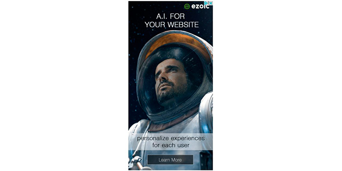
Ezoic: Tapping into buzzwords leads to effective ads (HTML5 development)
The future has become synonymous with staying competitive and profitable. Successful brands are those that adapt, innovate and adopt new technology (or ad standards) quickly. “Agility” and “flexibility” aren’t just for strategy sessions and start-ups – they’re necessary components of a strong Digital Creative Production strategy, too.
That’s one reason Ezoic’s high quality banners stand out.
Artificial intelligence (AI) and a highly personalized web experience are some of the buzziest topics in the digital marketing ecosystem. Savvy digital marketers and forward-thinking brands know that the future of good online display campaigns is in delivering messaging that’s tailored to every viewer’s preferences.
That awareness is why Ezoic’s effective ads can say so much with so little. Their target audience will be intrigued by anything that promises to leverage AI or build a more personalized browsing experience for viewers. And the space-oriented imagery further supports the ‘futuristic,’ cutting-edge messaging.
