Online banner ads? Pulling your hair out trying to understand why your HTML5 ads aren’t working? While your ads may be aesthetically pleasing, it takes more than eye candy to persuade people to actually care about them.
You might be shelling out money for Effective Ads that your target audience loves to hate. People might hate your online banner ads because:
1) They Start without Permission
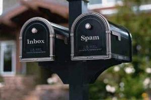
Today’s modern internet marketing is highly personalized and permission-based. Anything that is unsolicited is instantly given the worst label a marketing tool can have: spam. For banner ads that offer interactivity or play an animation or video (or all of the above), people can easily hate it if it plays on its own. The main reason for this is because people aren’t browsing the web specifically to view your Dynamic Ads. If you offer interactivity, let your target audience trigger the interaction and take it from there. Always practice permission-based marketing.
2) They Tend to be Distractions
This goes hand in hand with the above item: banner ads that serve to distract people from what they’re doing will only backfire. In this infographic about banner ads, you’ll notice that the top reason why people don’t click them is because they don’t want to be distracted (61%). You may think you can do little about this as you can’t very well change their minds, but with great ad design and proper targeting of audiences you can grab a little bit of attention and that is all it takes for them to consider that they may be interested in what your Creative Banner has to offer.
3) They are Annoyingly Positioned
The worst case scenarios here are interactive ads that expand when the mouse pointer rolls over them AND they are positioned in a place where the mouse usually hovers over. That is a sure way to pester your target audience into never wanting to see your ad. Of course, most banners are static, but they can still be inconveniently positioned, such as when they’re too close to the navigation bar of a website or they are taking up a lot of space in a portion of the webpage where they should’t be. Modern responsive website design should also be taken into consideration: ads that don’t respond to screen sizes can mess up the entire website layout. Always take these factors into consideration as they are numerous standard banner sizes for ads.
4) They Might Lead to Pop Ups or Spam
Some websites have been employing pop ups wisely — minimizing their interruption factor and turning them into polite notifications of Responsive Ads that people may be interested in; However, it’s still best to just avoid them. Imagine a large 700 x 320 pop-under ad that occupies a large area of real estate of a webapge that’s nigh unavoidable, and when people accidentally click it the ad launches a pop up that takes up the entire screen. It’s advertising suicide.
5) They’re Irrelevant
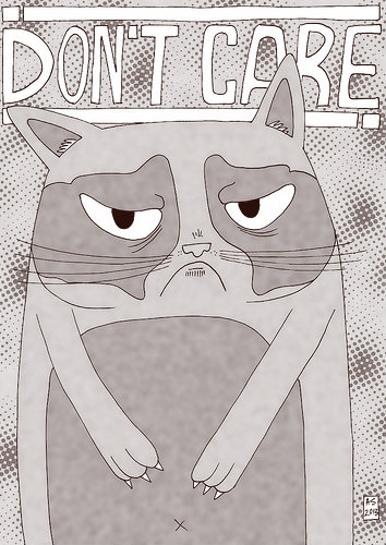
The worst reason why people hate your banner ads is: they aren’t relevant. They simply don’t care. In the same infographic we mentioned above, irrelevance is the second most common reason why people don’t click ads. They DID see the ad, but they didn’t care for it.
Better target marketing can minimize the risk of displaying irrelevant ads. You can target specific ad versions to market segments based on demographics, location, or online behavior. Retargeting through using browser cookies and mining data from third party, demand side platforms can also help greatly, as this ensures that the interest and preference are there when you display your ad versions.
Do you make banners people love? Check out the funny video summary:


